Client:
dnaunion
Project:
dnaunion
Brief:
dnauinon is the largest marketing and communication holding company in Iran. Most of the members of the group developed inside the network from an small business unit to a complete independent, well-established company. They needed an identity and branding to present them as a united group of people who share the same vision and belong to the same tribe, despite the fact they all came from different backgrounds. In other words they all have their own dna but when unified together, they form a new kind of DNA which is creative, strong, honest and reliable.
Our Solution:
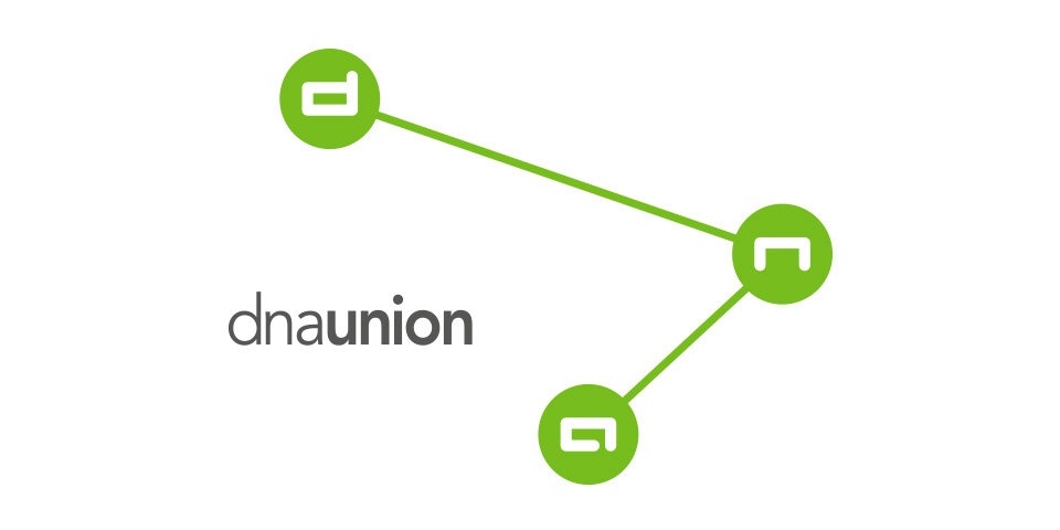
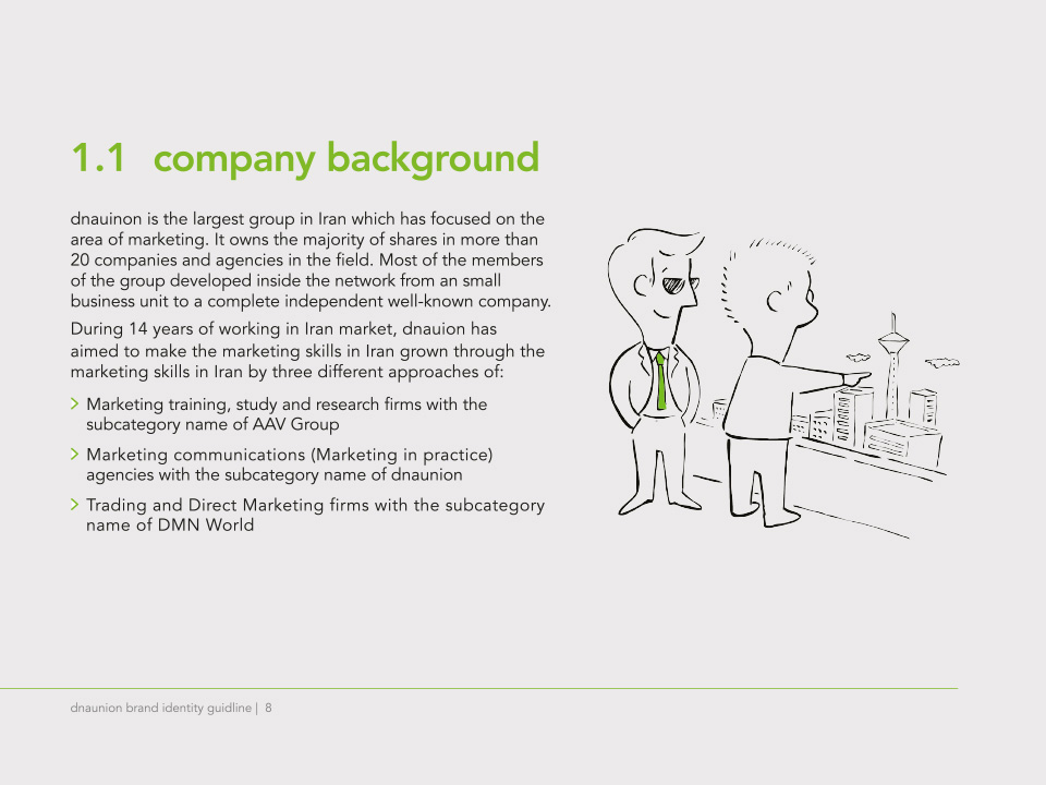
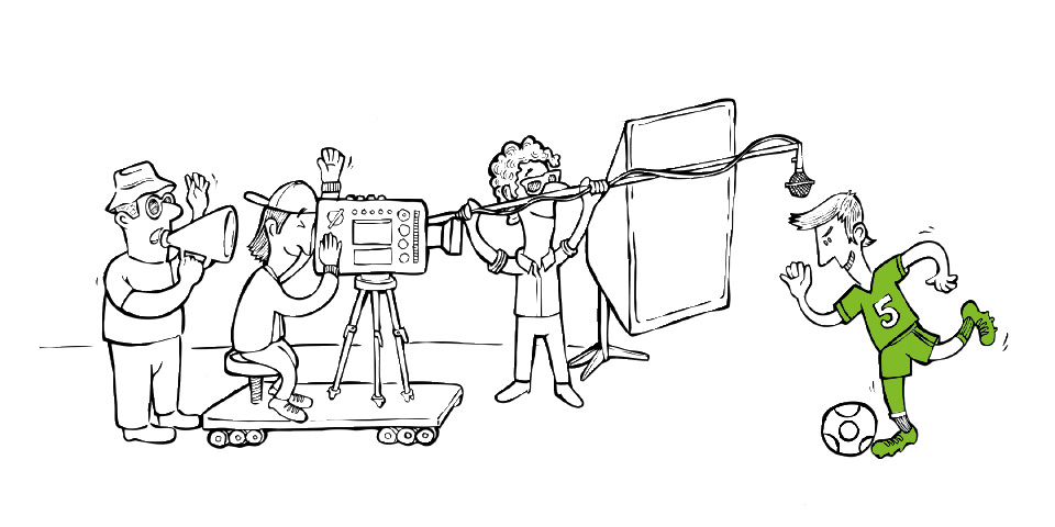
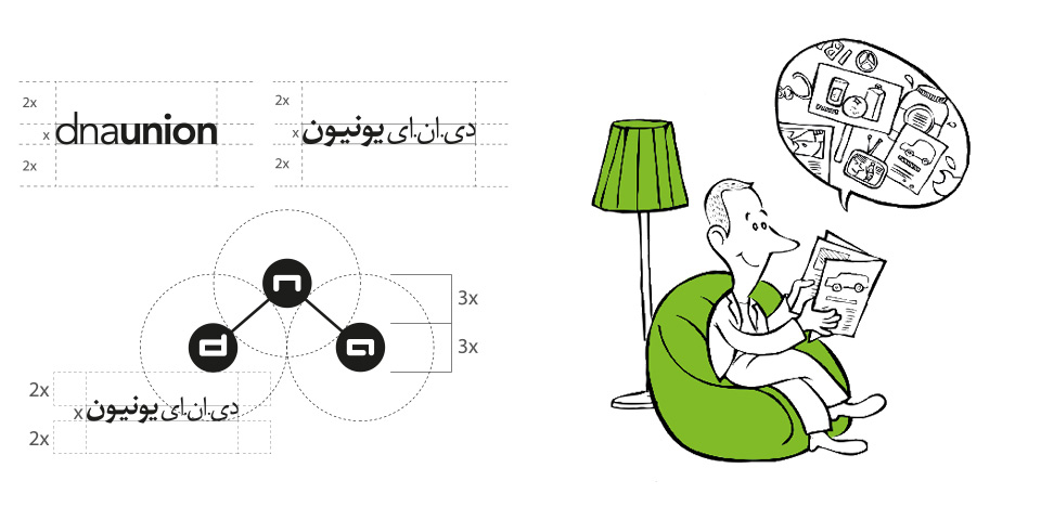
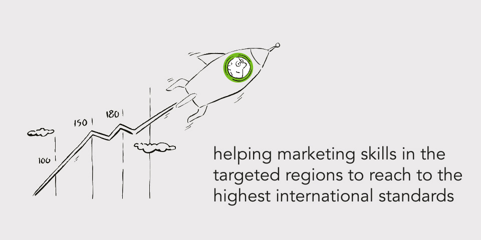
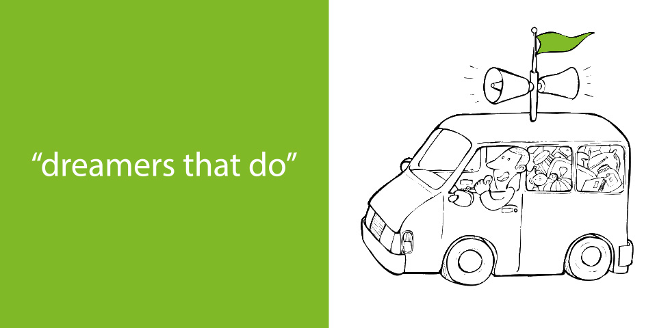
The visual identity needed to be simple, flexible, friendly and show unity. dnaunion symbol’s visual form is derived from two concepts: the molecular structure and the DNA model. The symbol is made of three circles interconnected by arms. Each ball contains one of dna letters which can move in different directions. This reflects flexibility, dynamism, energy and adaptability. For visual style we created different black and white illustrations which show different aspects of dnaunion's members daily life with a witty language.
