Client:
Eigg Supermarket
Project:
Eigg Supermarket
Brief:
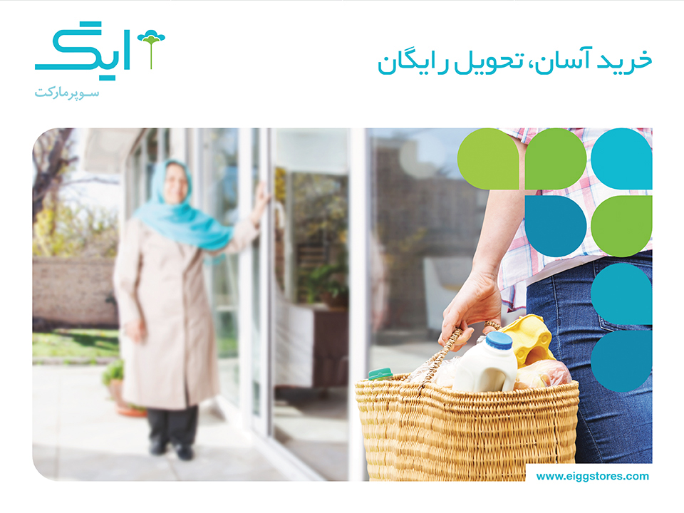
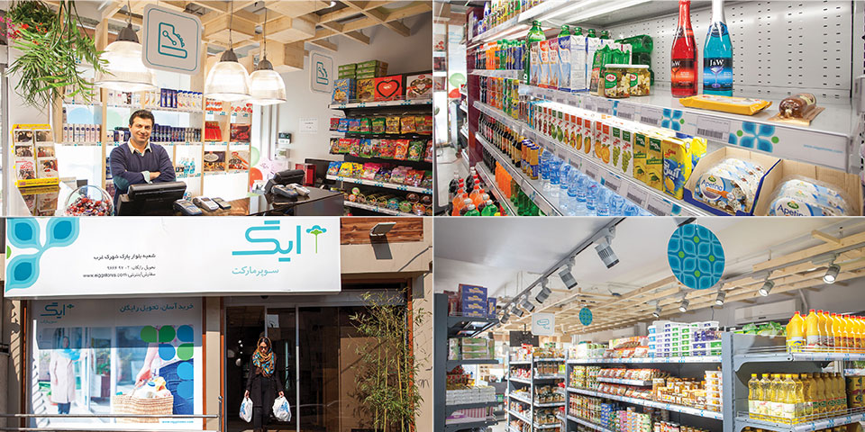
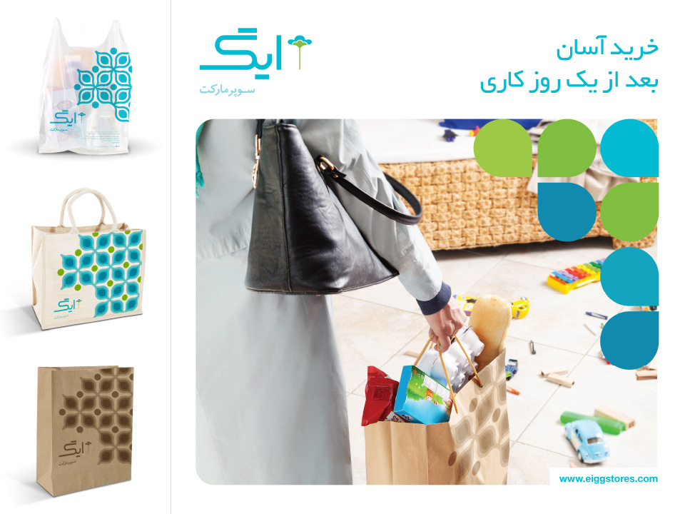
Retail industry faces way too many challenges in the Iranian market. One of the most important ones being "the right relationship with customers". Eigg Supermarket Chain wanted to form a valuable bond with its customers through creating a tranquil, reliable and wholesome experience. The nature of chain supermarket makes the brand's customer range as diverse as possible –from youngest to oldest-. So Eigg's main challenge was to communicate these qualities in a way that it's appealing to this large target market, with a particular approach to environmentalism, seniors and children.
Our Solution:
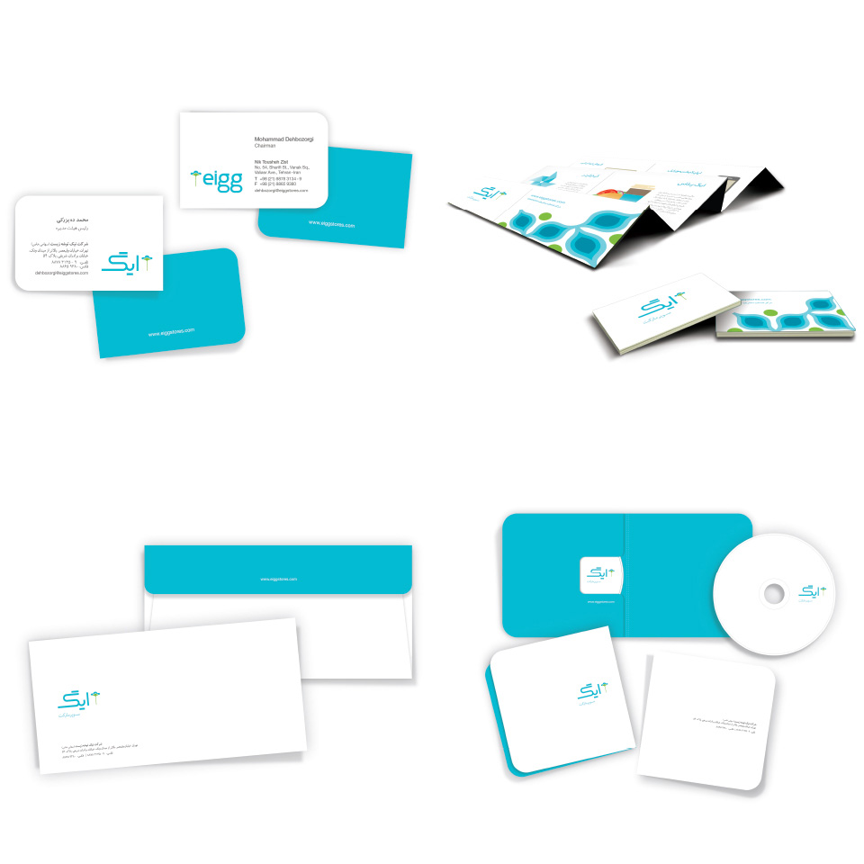
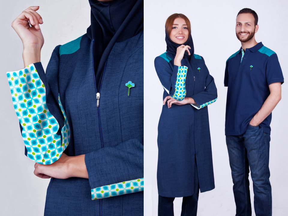
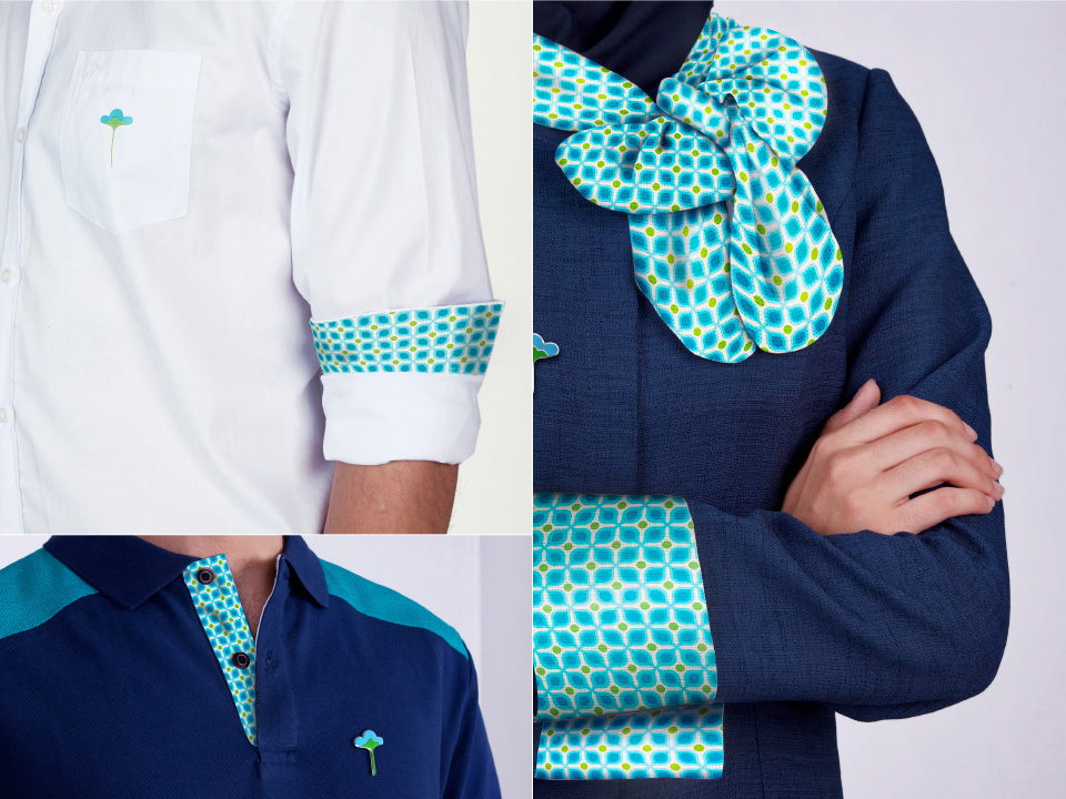
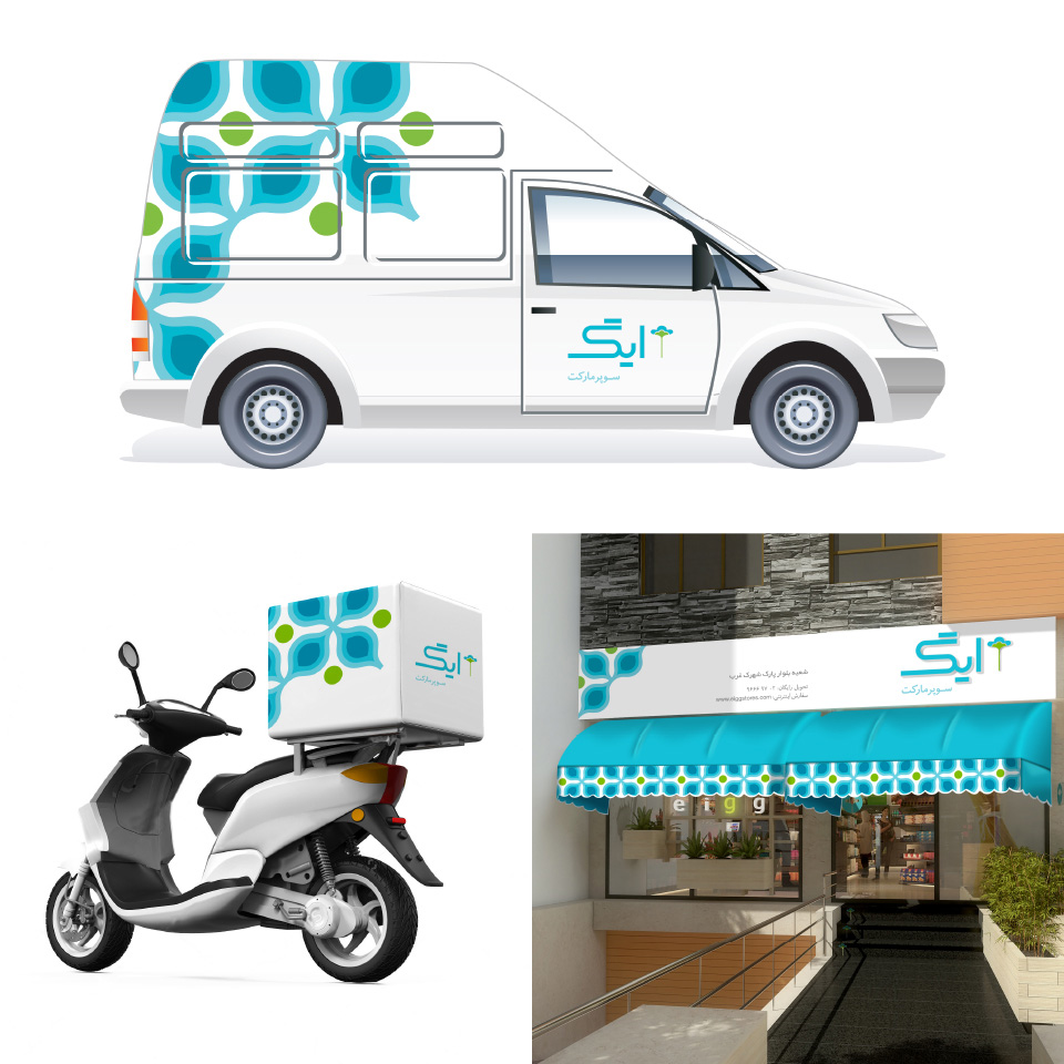
For this project, Eshareh Brand Solutions team got inspired by the quote "Design for the young and you exclude the old; design for the old and you include the young". Eigg's identity developed through looking at lifestyles and design elements in the 60's (which are the youth-years of now elderly customers). Green and blue colors was employed to convey the concepts of tranquility, health and reliability. Eigg's logo is designed to look like spring flowers, a symbol of vitality and constant development of the brand.